Education Attainment in USA (graphed on the street level)
USA Facts
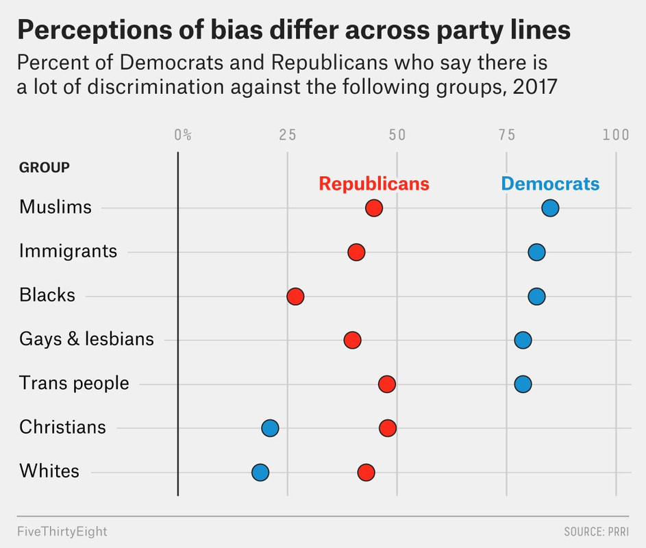
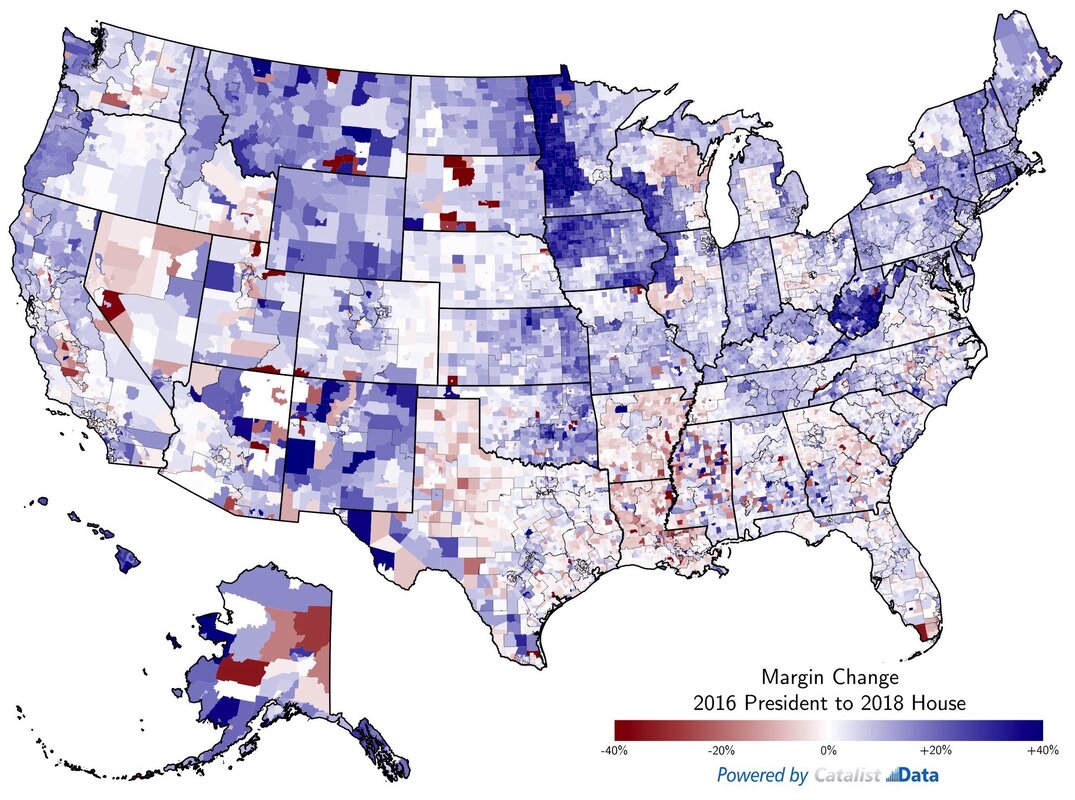
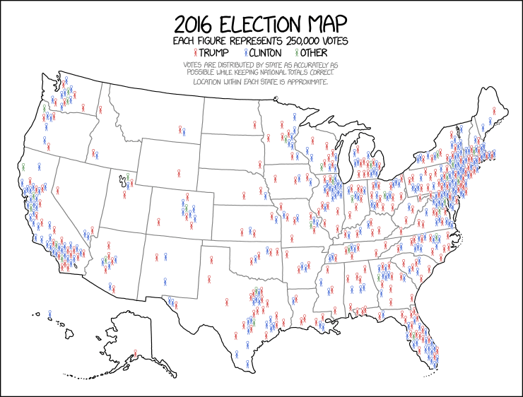
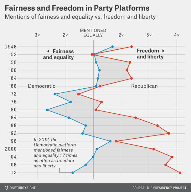
2016 election stats
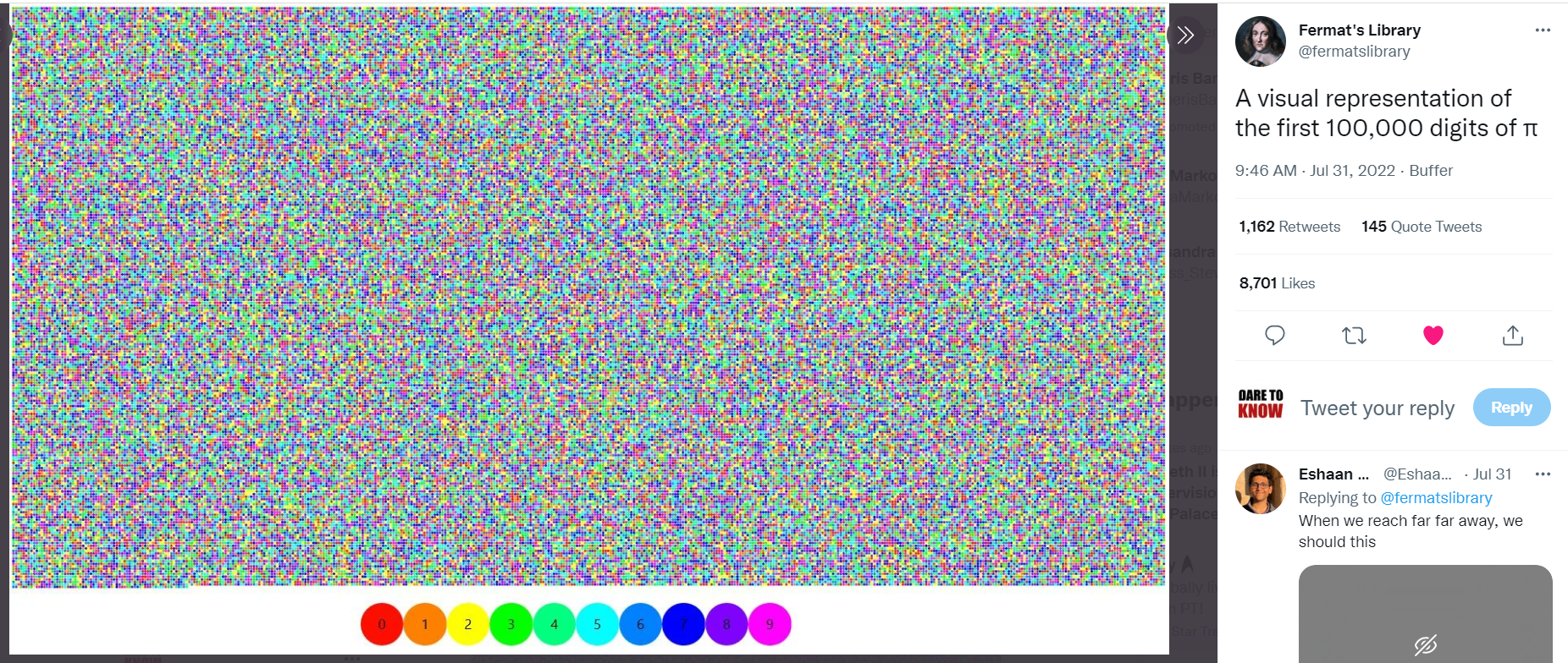
Spurious Correlations
USA Facts
2016 election stats
Spurious Correlations
Link the over-reliance on the expertise of those who do interpretation of statistical data VS those involved in this pseudo-science http://en.wikipedia.org/wiki/Live_blood_analysis VS those experts who read your fMRI results or mammograms or X-rays which is covered somewhat by her (and her TED talk) http://web.mit.edu/bcs/nklab/nancysbraintalks/
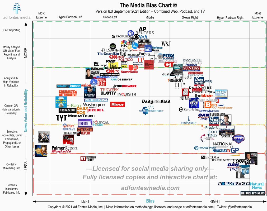
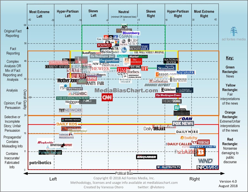
2021 version 8 above. A 3 year older version (2018 or so) of the media bias chart is below:
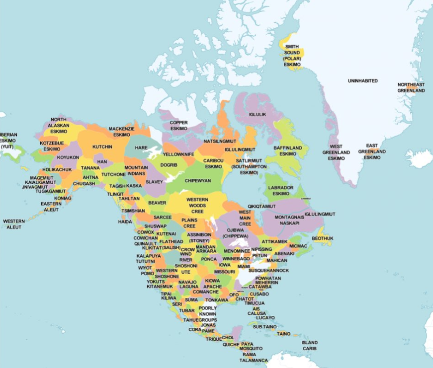
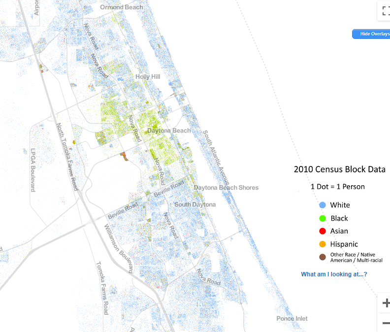
Racial Dot Map of USA (daytona area screenshot below)

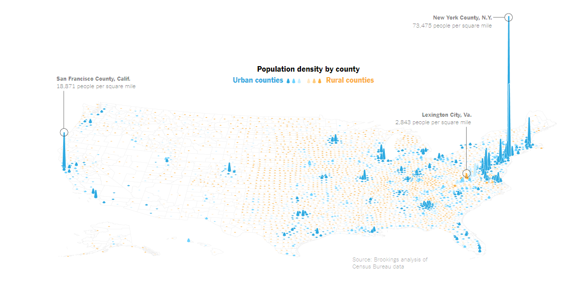
STATS/GRAPHS/MAP (the ELMO
applied math day)
Map: Six Decades of the Most Popular Names for Girls, State-by-State
Music Timeline – very interesting
This is how much money people with your personality make & the graphic to use
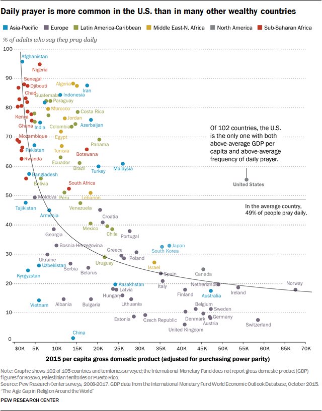
22 stat charts: http://bit.ly/1B4dL0o
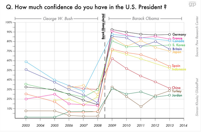
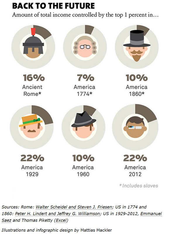
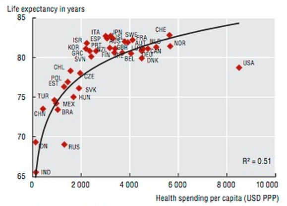
The 13 scariest charts about our country and our world http://wapo.st/1DKZ4k5
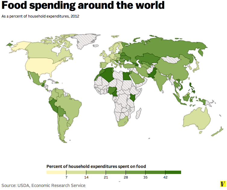
40 maps that explain food in America - view 6, 14, 16, 18, 20, 25, 26, 38
http://www.nationalgeographic.com/what-the-world-eats/ - GREAT
http://www.vox.com/2014/7/6/5874499/map-heres-how-much-every-country-spends-on-food
http://i100.independent.co.uk/article/this-is-a-map-of-everything-on-the-internet--lySlNrE37e
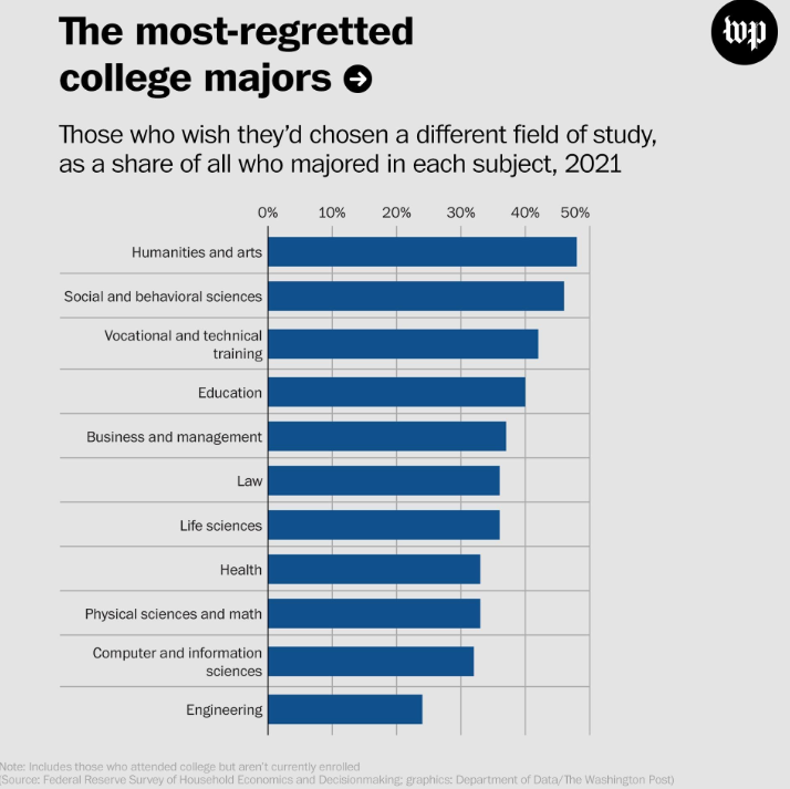
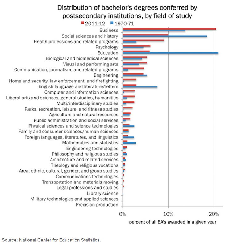
College Major Shifts 1970-2010
World University Rankings
Which College—and Which Major—Will Make You Richest?
Is it better to rent or buy a house calcluator
Most Americans live in Purple America, not Red or Blue America - The Washington Post
Mapping Poverty in America - The New York Times
Avg Weekly Wages Map USA
USA counties education levels map
USA map on gun ownership
Change in Insured Americans (due to Obamacare)
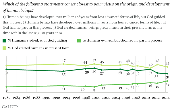
Creationism in public schools, mapped. Where tax money supports alternatives to evolution.
Map of pride in your state (USA)
British stereotypes of every US state
Which State Has The Worst Drivers?
Child poverty in the U.S. is among the worst in the developed world http://wapo.st/1xOuLaf
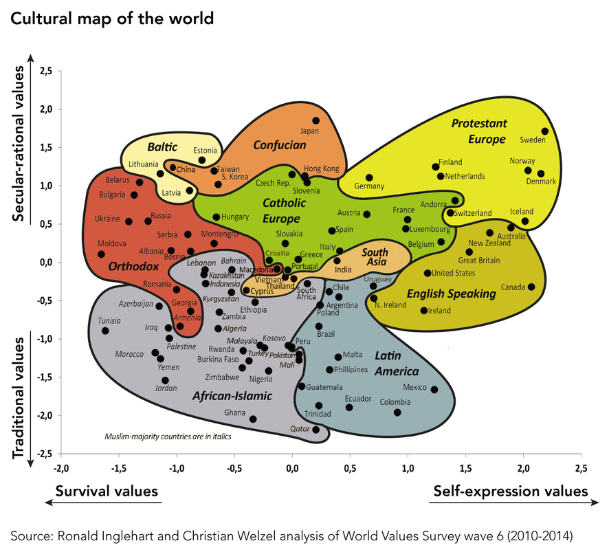
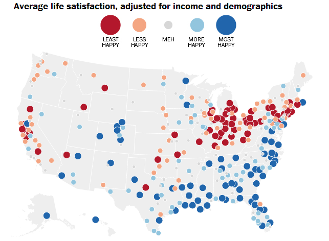
Global map of national well being
Overall Rankings — The Good Country Index
The World Is Falling Out of Love With America — Again
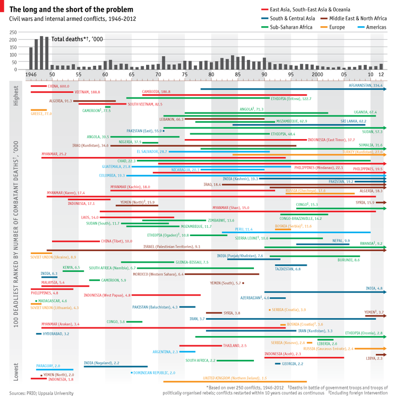
Civil wars and armed conflicts: Inner turmoil | The Economist
How Vaccine Fears Fueled The Resurgence Of Preventable Diseases : Shots - Health News : NPR
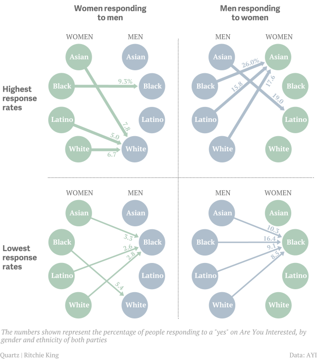
The uncomfortable racial preferences revealed by online dating – Quartz
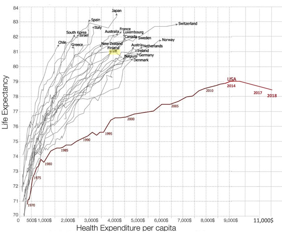
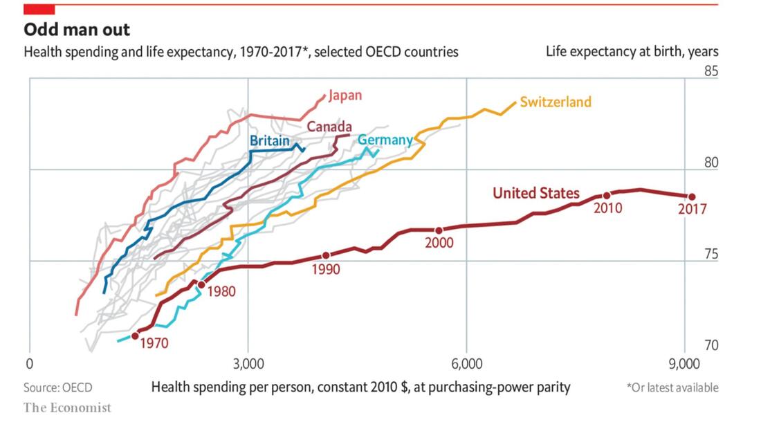
The Singular Waste of America's Healthcare System in 1 Remarkable Chart - Matthew O'Brien - The Atlantic
Time lapse map of every nuclear explosion ever on Earth | memolition
Math/Quantification in Education: SCHS as a case study
Education Is Not 'Moneyball': Why Teachers Can't Trust Value-Added Evaluations Yet http://www.edweek.org/tm/articles/2014/08/27/fp_eger_valueadded.html
Data shows one-third of Florida's top educators have students progressing below expectations
Gates Foundation opposes release of teachers’ VAM scores in Florida
We were once #57 or so in the Newsweek rankings; we were #382 in country in 2011; we are currently UNRANKED. But look at their methodology vs the methodology Florida uses (which is new this year and says we are 75th best HS in FL):
http://www.usnews.com/education/best-high-schools/florida/districts/volusia-county-schools/spruce-creek-high-school-5628
we are #180 here: http://apps.washingtonpost.com/local/highschoolchallenge/#.U0RmfZnJBFE.twitter
https://app2.fldoe.org/Ranking/Schools/RankDetailSchType.aspx?schT=3
https://app2.fldoe.org/Ranking/Districts/
vs Teacher Evaluation and School Grade results: http://www.fldoe.org/profdev/pdf/TeacherEvaluationResults.pdf
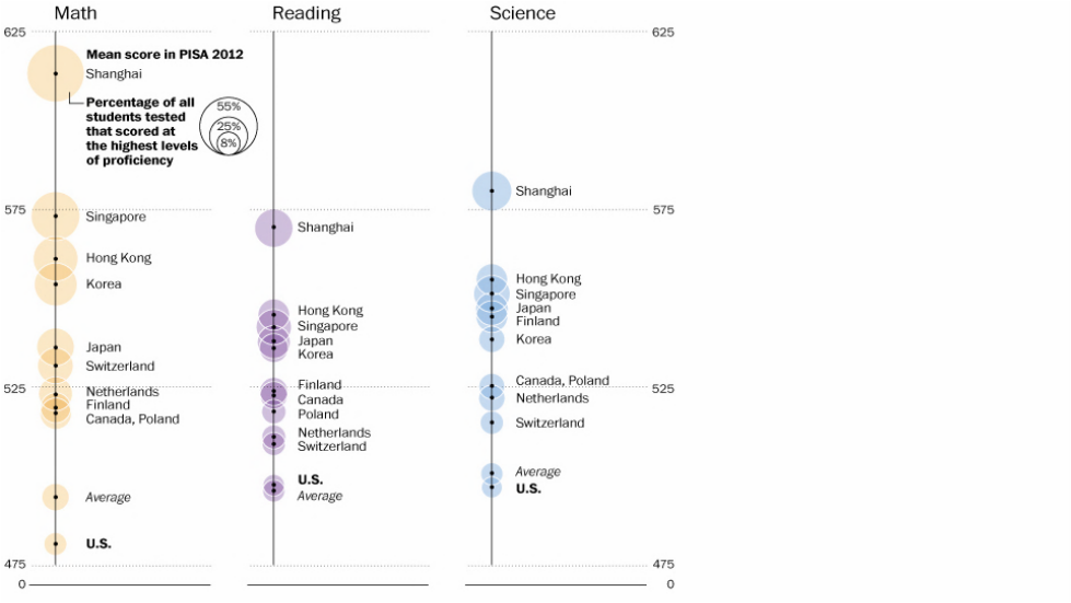
or the PISA international test of student achievement (USA =#19): http://www.oecd.org/pisa/46643496.pdf
OR How U.S. students compare internationally - The Washington Post
one national ranking of school quality for USA: http://cdn.theatlantic.com/static/newsroom/img/2012/09/18/ed-graphic-1-map.jpg
Map: Six Decades of the Most Popular Names for Girls, State-by-State
Music Timeline – very interesting
This is how much money people with your personality make & the graphic to use
22 stat charts: http://bit.ly/1B4dL0o
The 13 scariest charts about our country and our world http://wapo.st/1DKZ4k5
40 maps that explain food in America - view 6, 14, 16, 18, 20, 25, 26, 38
http://www.nationalgeographic.com/what-the-world-eats/ - GREAT
http://www.vox.com/2014/7/6/5874499/map-heres-how-much-every-country-spends-on-food
http://i100.independent.co.uk/article/this-is-a-map-of-everything-on-the-internet--lySlNrE37e
College Major Shifts 1970-2010
World University Rankings
Which College—and Which Major—Will Make You Richest?
Is it better to rent or buy a house calcluator
Most Americans live in Purple America, not Red or Blue America - The Washington Post
Mapping Poverty in America - The New York Times
Avg Weekly Wages Map USA
USA counties education levels map
USA map on gun ownership
Change in Insured Americans (due to Obamacare)
Creationism in public schools, mapped. Where tax money supports alternatives to evolution.
Map of pride in your state (USA)
British stereotypes of every US state
Which State Has The Worst Drivers?
Child poverty in the U.S. is among the worst in the developed world http://wapo.st/1xOuLaf
Global map of national well being
Overall Rankings — The Good Country Index
The World Is Falling Out of Love With America — Again
Civil wars and armed conflicts: Inner turmoil | The Economist
How Vaccine Fears Fueled The Resurgence Of Preventable Diseases : Shots - Health News : NPR
The uncomfortable racial preferences revealed by online dating – Quartz
The Singular Waste of America's Healthcare System in 1 Remarkable Chart - Matthew O'Brien - The Atlantic
Time lapse map of every nuclear explosion ever on Earth | memolition
Math/Quantification in Education: SCHS as a case study
Education Is Not 'Moneyball': Why Teachers Can't Trust Value-Added Evaluations Yet http://www.edweek.org/tm/articles/2014/08/27/fp_eger_valueadded.html
Data shows one-third of Florida's top educators have students progressing below expectations
Gates Foundation opposes release of teachers’ VAM scores in Florida
We were once #57 or so in the Newsweek rankings; we were #382 in country in 2011; we are currently UNRANKED. But look at their methodology vs the methodology Florida uses (which is new this year and says we are 75th best HS in FL):
http://www.usnews.com/education/best-high-schools/florida/districts/volusia-county-schools/spruce-creek-high-school-5628
we are #180 here: http://apps.washingtonpost.com/local/highschoolchallenge/#.U0RmfZnJBFE.twitter
https://app2.fldoe.org/Ranking/Schools/RankDetailSchType.aspx?schT=3
https://app2.fldoe.org/Ranking/Districts/
vs Teacher Evaluation and School Grade results: http://www.fldoe.org/profdev/pdf/TeacherEvaluationResults.pdf
or the PISA international test of student achievement (USA =#19): http://www.oecd.org/pisa/46643496.pdf
OR How U.S. students compare internationally - The Washington Post
one national ranking of school quality for USA: http://cdn.theatlantic.com/static/newsroom/img/2012/09/18/ed-graphic-1-map.jpg
FYI on new data sets since the stats lab days:
22 stat charts: http://bit.ly/1B4dL0o
The 13 scariest charts about our country and our world http://wapo.st/1DKZ4k5
40 maps that explain food in America - view 6, 14, 16, 18, 20, 25, 26, 38
22 stat charts: http://bit.ly/1B4dL0o
The 13 scariest charts about our country and our world http://wapo.st/1DKZ4k5
40 maps that explain food in America - view 6, 14, 16, 18, 20, 25, 26, 38
| freakonomics_preview__1_.pdf |
